A typography historian shares his favorite typefaces |
Paul McNeil just published his comprehensive typographical overview, The Visual History of Type. To celebrate, he also published a list of his six favorite faces for It's Nice That, starting with the first compact italic:
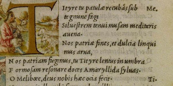
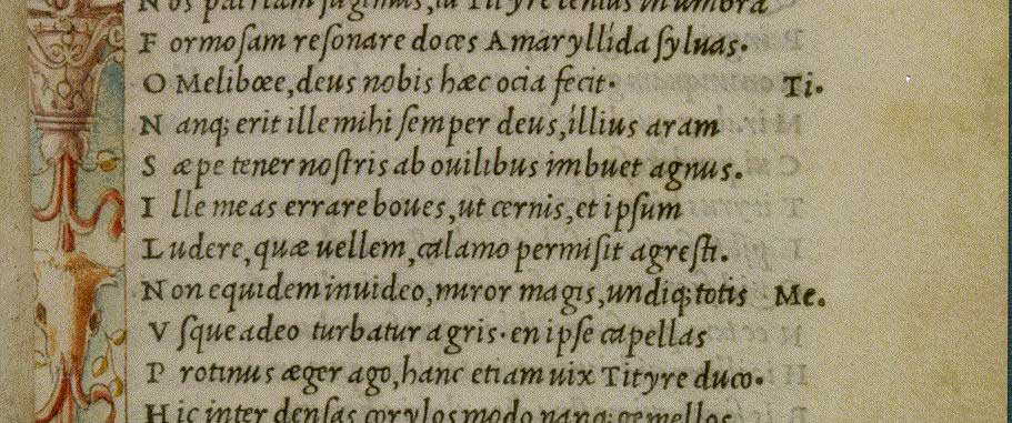
The Aldine Italic / Griffo’s Italic / 1501Few typefaces have had as great an influence on Western culture as Francesco Griffo’s Italic. At the end of the 15th century, when most books were large and heavy, Aldus Manutius commissioned Griffo to cut this compact, inclined letterform. Easily legible at small sizes, the Aldine Italic permitted the production of small, affordable, portable books suited to the requirements of an educated, mobile class of literate individuals. Over the next three centuries, the practice of publishing changed everything. By allowing texts to be reliably reproduced and disseminated in an almost limitless time frame, it triggered new ideas that profoundly challenged all forms of institutional control, leading to dramatic religious reforms, radical socio-political changes, and to the scientific worldview that initiated the modern era.
• The Visual History of Type (via It's Nice That)
Image via ilovetypography.com
http://feeds.boingboing.net/~r/boingboing/iBag/~3/IuOYKUyrdBE/a-typography-historian-shares.html
| Комментировать | « Пред. запись — К дневнику — След. запись » | Страницы: [1] [Новые] |


